Trainer Form: Signal or Noise?

Introduction

On day two of the November 2013 Cheltenham meeting David Pipe drew a blank from his seven runners. For many people this result pointed to the Pipe stable being out of form. But whatever might have been ailing the yard on Saturday had disappeared by Sunday morning, with four winners, including The Greatwood, one of the most competitive handicap hurdles in the calendar. No doubt on Sunday evening the Pipe yard was marked out as one to follow. So what of trainer form, is it possible to identify yards that are in or out of form? In the woefully misnamed ‘Statistics’ section of the Racing Post the ‘Hot Trainers’ table uses Strike Rate (winners to runners) over the last 14 days , whilst  the ‘In Form’ table in the ‘Trainerspot GB’ table uses Run To Form, again over the last fortnight. Neither table is useful.  Both are based upon too few runners to be able to draw any meaningful conclusions. These tables are an excellent example of attempting to draw inference from a small information set – whilst this instinct helped us survive when faced with perceived mortal dangers in the past, the very same instincts are likely to mislead in the more prosaic setting of horse racing. Whilst the data in the  ‘In Form’ table isn’t useful, this is only because there are too few observations to be able to draw any firm conclusions. However, the idea of considering trainer form as an average or median of how close to form the horses under the trainers care are running makes intuitive sense.

The analysis that underpins this piece was carried out in the R statistical environment accessing Raceform Interactive data focussing on the 2010-11 and 2011-12 National Hunt seasons. Thanks to Simon Rowlands and James Willoughby for their input.

Trainer Form Variable Definitions

The starting point for the analysis that follows is to define and calculate a Run To Form (RTF) variable. RTF is defined as follows:  the Racing Post Rating (RPR) achieved by each horse in a race subtracted from the maximum RPR achieved by each horse in its runs up to and including the race in question. A horse has to have run more than three times to qualify for consideration. This filter is used to reduce the influence of lightly raced progressive horses. The maximum value RTF can take is zero.

Trainer Form Absolute (TFA)

The next step is to define and calculate a measure of trainer form. Trainer Form Absolute (TFA) is the median RTF for all the runners of a trainer over a particular time period.  Using the 2010-11 National Hunt season Graph 1 shows a histogram of TFA for those trainers that had at least 50 runners over the season. 132 trainers qualified. Note the negative skew. This is a common characteristic of form data in horse racing.  It is difficult to run close to form wheras there are many and varied reasons for horses running below form. The negative skew in RTF at the horse level aggregates to negative skew in TFA at the trainer level. Graph 2 shows the same information as a Box Plot.

TFormHisto

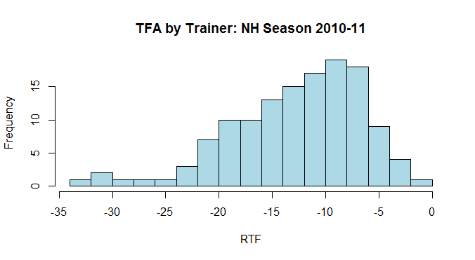
Graph 1: Distribution of trainer TFA NH season 2010-11

TFormBoxPlot

Graph 2: Box Plot of trainer TFA NH season 2010-11

So does a ranking of TFA indicate in form trainers at the top and out of form trainers at the bottom? Inspection of Graphs 1 and 2 highlights the problem with using TFA as a measure of trainer form. The range of TFA across trainers is so wide that the top and bottom of the TFA list won’t change often enough to be able to identify trainers in and out of form – for example if Nicky Henderson normally runs at a -5lb TFA and is currently running at -8lb TFA he would still be near the top of the TFA list, wheras he is running 3lb below his normal TFA rate. It is also of note that the variability of TFA per trainer is correlated with their TFA. Either the better horses, who are at the better yards, run more consistently, or the better trainers are able to get their horses, who are better than those elsewhere, to run more consistently. Or a combination of the two. In this context better means those yards with the highest TFA values.

Trainer Form  Relative (TFR)

Given the concerns about using TFA a measure of relative run to form can be defined and calculated that takes into account the usual RTF per trainer. Trainer Form Relative (TFR) is defined as the difference between TFA in a particular time period and TFA in a previous time period. TFR enables a direct comparison between trainers with widely different absolute levels of form (TFAs). Now Nicky Henderson’s -3lb TFR can be compared with a trainer whose TFA is normally -12lb and is currently running at -9lb, to give a +3lb TFR.

For the analysis that follows TFR is calculated for each of the seven months October 2011 through to April 2012. TFRs are calculated by taking the TFA in each month by trainer and subtracting the TFA posted by trainer for the previous season 2010-11.  So, starting with October 2011, how is its TFR related to the TFRs posted one month later? Graph 3 below shows a significant relationship. At first sight this appears to be clear evidence that trainer form in October 2011 helps predict trainer form in November 2011.

TFormt_t+1

Graph 3: Relationship between TFR October to November 2011  

What happens if we compare TFR in October 2011 with months further out? If form is temporary the relationship should decline through time. If October form predicts November form, it shouldn’t predict December form to the same degree. In the jargon we can postulate an  autoregressive AR(1) process. What we see in the data is the relationship shown in Graph 3 is as strong between October and November as it is between October and other months. See Table 1 below for correlation coefficients between t and t+1, t+2, t+3 using November 2011 as month t.

Correlation of November 2011 TFR with

December 2011             0.44

January 2012                0.51

February 2012              0.43

March 2012                    0.47

April 2012                       0.37

Table 1: Correlation of TFR months t with t+1, t+2, t+3 etc

We shouldn’t observe the same level of correlation across the months. It suggests form has a permanent component to it – an oxymoron. So how to explain this result? Imagine we can fast forward one year. We calculate TFA per trainer based upon the season 2011-12. This enables us to compare the results of a trainer in 2010-11 with the next season 2011-12. If we classify TFR as ABOVE or BELOW zero, and then further classify according to whether a trainer had a BETTER or WORSE season in 2011-12 relative to 2010-11, we see how RTF looks month by month in Table 2 below.

BETTER 2011-12 form                                  WORSE 2011-12 form

                              ABOVE       BELOW                                                            ABOVE       BELOW

ABOVE                     76               42                                                                         8                  28

BELOW                     33               16                                                                       29                109

Table 2: classification of form by month by year

Remember we have peaked into the future in calculating Table 2. It isn’t available until the end of the second season. The number of observations in the ABOVE-ABOVE and BELOW-BELOW categories are too high for the TFR measure to be useful as an indicator of form. In other words when a trainer is ABOVE or BELOW form in a particular month it is likely that they will continue in that category for the next month and the next month after that and for the duration of the season. The problem here is that the comparison used in the TFR calculation, namely the form of the trainer from the previous season, is likely to suffer from bias.  For some trainers it will be higher or lower than the true level of form a trainer can expect, and for those that posted towards the extremes of TFA they are likely to revert back to some degree in the next season. Bias such as this is difficult to remove and as a result relative measures of trainer form such as TFR are as flawed in their own way as absolute measures of trainer from such as TFA.

Summary

I started this analysis with the prior view that trainer form probably exists.  My view now is that it if it does exist it is very difficult to measure.  Absolute measures of trainer form do not exhibit enough variability, wheras relative measures have problems in deciding on an appropriate comparison. For some the measures of trainer form defined above might be too simplistic, arguing that more complex definitions are required. This is entirely possible. But as complexity of definition increases, particularly if it is one of many derivations tried, so does the risk that the measure will work only for the sample of data on which it was tried. If you torture the data for long enough it will tell you anything.

There is another possible use of trainer form – but more in how it is perceived by the market. Consider Graph 4 below. It shows TFA on the x-axis and Strike Rate on the y-axis by trainer for the 2010-11 season. It is the same data expressed in different ways.

TFormTFA_SR

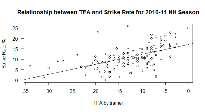
Graph 4: Strike Rate vs trainer form

Strike Rate is a popular measure of form, RTF (and its variants TFA and TFR) less so. Yet Strike Rate is noisier and contains less information than RTF. Given the popularity of trainer form as an idea, and the popularity of Strike Rate as a proxy for trainer form, it is possible that the runners of trainers with a high/low Strike Rate relative to their TFA could have odds that are too far away from their correct values as the market considers these trainers, based upon a faulty premise, to be in or out of form. Armed with the appropriate data this is a testable proposition.

Winning Distances: Trip, Going, Field Size, Race Class & Handicapping

Introduction

The distance that horses finish relative to each other in horse racing is an important consideration in deciding what rating to apply to each horse post-race by public and private handicappers. Whilst it is obvious that trip will affect winning distances, what of going, field size and race class? To what extent do these factors make a contribution, and does the official handicapper take these factors into account in handicapping horses post-race?

Method, Dataset & Definitions

The analysis that underpins this piece was carried out in the R statistical environment accessing Raceform Interactive (RI) data for turf handicap races that took place during the 2011, 2012 and 2013 flat seasons in Great Britain. Races were placed into categories as follows:

Trip – Sprint (up to 6.5f), Mile (6.5-9.5f), Mid-distance (9.5-12.5f) and Long-distance (12.5f+)

Going – Heavy (HY), Soft (S), Good-Soft (GS), Good (G), Good-Firm (GF) and Firm (F)

Field Size – Tiny (fewer than 4 runners), Small (5 to 12 runners) and Large (more than 12 runners)

Race Class – High (Classes 1, 2 and 3) and Low (Classes 4, 5 and 6)

The number of races that took place in each category is given in Table 1 below.

Trip 2011 2012 2013
LONG 494 483 510
MID 450 421 448
MILE 1145 1103 1170
SPRINT 350 339 348

Table 1: Number of races by year by trip

Ground classifications used were those applied by RI rather than the official going. Proportions of races by Going category are given in Table 2a below. The effect of the wet weather in 2012 and dry summer in 2013 can be seen in the proportion of races that took place on the Soft and on Good-Firm in each year.

Going 2011 2012 2013
F 0.0% 0.6% 0.6%
GF 14.4% 14.6% 22.3%
G 65.5% 41.1% 57.4%
GS 14.8% 21.7% 12.6%
S 4.7% 17.1% 5.9%
HY 0.5% 4.9% 1.2%

Table 2a: Proportion of races by year by going category

The number of races by year by Field Size is given in Table 2b below. Field Sizes fell in 2013. The argument that fast going was responsible for the drop in Field Sizes is spurious. In 2011 there were 287 races on GF with small Field Sizes. In 2012 this decreased slightly to 262 races. In 2013 there was a substantial increase to 475 races. Other factors are responsible for the drop experienced in 2013.

Field Sizes 2011 2012 2013
LARGE 576 574 491
SMALL 1863 1772 1985
TINY 52 32 120

Table 2b: Number of races by year by field size

In Table 2c below the relationship between Race Class and Field Size is shown. As expected there is a greater proportion of High Class races with Large Field Sizes. In the analysis that follows races categorised as TINY were excluded from the analysis.

Race Class LARGE SMALL TINY
HIGH 558 963 29
LOW 1083 4656 175

Table 2c: Number of races by class and field size


Winning Distances and Going

Graph 1 below shows winning distances by Trip for each Going category. Winning distance is defined as the distance between the winner of a race and the horse coming third.  There aren’t many races that take place on Firm Going and as a result its black line representation on the graph should be treated with caution. Notice how winning distances are similar for the GS, G and GF categories, wheras for Soft and Heavy Going winning distances are quite different. There is also a non-linear relationship between winning distance and Going as Trip increases in distance. The minimum number of categories of Going that best describes winning distances is three:  Heavy, Soft and an amalgamation of the other Going categories. We know from Table 2a that few races take place on Heavy going. As a consequence excluding these races, rather than amalgamating with the Soft going category, will improve the balance of the analysis that follows.

plot1

Graph 1: Winning distance by going category

Winning Distance and Race Class

On average winning distances are higher in Low Class races. Graph 2 below shows median winning distance by Trip by Race Class. The relationship is linear with trip for Low Class races. For High Class longer distance races the median winning distance is lower than for mid distance races. This is counter intuitive. It could be explained by High Class long distance races being run at a different pace – more of a crawl and sprint, resulting in compressed winning distances, rather than an end to end gallop.

DistClass

Graph 2: Winning distance and Race Class

Winning Distance and Field Size

Winning distances are higher in Small Field Size races. Graph 3 below shows the median winning distance for Small and Large Field Sizes. It is possible the Field Size and Race Class winning distance effects are related due to the high relative proportion of High Class races with Large Field Sizes.

DistFSize

Graph 3: Winning Distance and Field Size

Contributions to Winning Distances

The information presented above shows that winning distances are affected by Trip, Going, Field Size and Race Class. Since some of these categories are related to each other analysis of variance (ANOVA) is used to attempt to disentangle the effects and see if all or just a subset of categories are important. In addition we can identify interaction (non-linear) effects, such as that between winning distance and Going. In Table 3 below a summary of the ANOVA table is presented. Apart from the obvious result that Trip and Going are highly significant in terms of explaining winning distances, Field Size and Race Class are important in their own right. In addition two interaction variables are included – Trip with Going and Trip with Race Class. The former is intuitive, the latter less so.

Category                    F Value                   p-value

Trip                              187.626                  2e-16

Going                             91.278                   2e-16

Field Size                      85.227                  2e-16

Race Class                    64.553                   1e-15

Trip*Going                    8.237                   2e-05

Trip*Class                      6.904                  0.000122

Table 3: ANOVA table of contributions to Winning Distance

Winning distances and Subsequent Handicap Changes

The official handicapper has detailed his policy with respect to handicapping here.  Given the wide range of inputs that he states go into his handicapping decisions, we should find a relationship between changes in handicap mark and the race categories examined in the previous section. A variable that takes into account handicap mark changes and winning distances is defined as follows:

lbPerL = (Mark change for winner – Mark change for 3rd)/(Winning distance 1st-3rd)

Graph 4 below shows winning distance on the x-axis and handicap changes winner to third on the y-axis. Whilst there is a relationship (correlation=0.6) there are other factors in addition to winning distances that are used to revise handicap ratings.

DistORchg

Graph 4: Winning distance and handicap changes

Pounds Per Length and Going

Handicap changes per length are lower for races that take place in Soft going. The median difference is 0.25 lbperL. So for with winning distances of 2 lengths, median handicap changes in Soft going are ca. 0.5lb less than on quicker Going.

ORchgGoing

Graph 5: Pounds per Length and Going

Pounds Per Length and Race Class

Handicap changes per length are higher for High Class races. The difference is 0.34 lbperL. With winning distances lower in High Class races, it appears as if the handicapper applies a standard handicap increase to the rating of winners regardless of Race Class.

ORchgClass

Graph 6: Pounds per Length and Race Class

Pounds Per Length and Field Size

Handicap changes per length are higher for races with larger Field Sizes. The difference is 0.33 lbperL. As with Race Class, it appears as if the handicapper applies a standard handicap increase to the rating of winners regardless of Field Size.

ORchgFS

Graph 7: Pounds per Length and Field Size

Understanding the Contributors to Handicap Changes

ANOVA is used to check if the differences seen in the graphs above are statistically significant. Table 4 below shows the handicapper does take into account Going, Field Size and Race Class in the handicap changes he applies to winning horses – the p-values show that each category explains a significant component of the lbperL variable. In the next section we examine if sufficient account is taken of the different race categories.

Category              F Value                 p-value

Trip                          106.119                < 2e-16

Going                         27.191               1.90e-07

Race Class               45.673               1.52e-11

Field Size                  42.151               9.10e-11

Table 4: Contributors to Winning Distances

Is Sufficient Account Taken of Different Race Categories?

If the handicapper takes sufficient account of race categories it should be the case that horses run equally well in their next race. The variable PctBtn (thanks to Simon Rowlands of Timeform for suggesting this variable, for example here) is defined as the percentage of horses beaten next time out by the winner of each race. If the handicapper has done his job, there should be no difference in the average PctBtn variable by race category. ANOVA is used again. Table 5 contains the results. The results for Field Size are statistically significant. It appears as if the handicapper does not raise the handicap mark of winners of large Field Size races by enough, since they beat a higher proportion of their rivals next time out than winners of races in other categories.

Category                   F Value                   p-value

Trip                             0.442                       0.7230

Race Class                0.098                       0.7545

Field Size                  4.821                        0.0282

Going                        0.668                        0.4137

Table 5: Contributors to Winning Distances

Summary

In addition to the obvious effect of Trip and Going on winning distances, Field Sizes and Race Class are also significant contributors. Whilst the handicapper appears to take these factors into account in setting handicap marks, in the case of large fields size handicap winners it appears that winners are insufficiently penalised. It is a small step to suggest that placed horses from large Field Size races are worthy of particular attention next time out.